New Navigational Changes To RunPod UI
Today, we are releasing a brand new look to the RunPod control panel, resulting in saved clicks and faster navigation through the platform. A few key changes will need some attention as you get acclimated. Here's a quick rundown of what has changed!
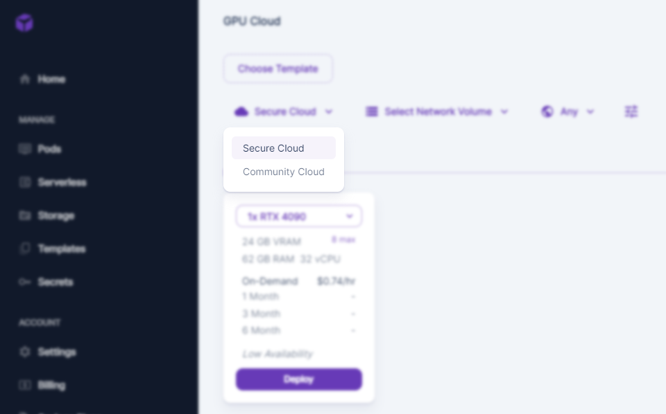
GPU Cloud
Secure and Community Cloud are now combined into one heading on the GPU Cloud page rather than having separate tabs on the menu. You can reach this screen by clicking Pods on the left and then clicking New Pod.
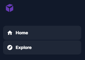
🧭 Explore
Official RunPod and community pod templates are now discoverable under an explore section.
Templates
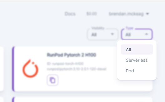
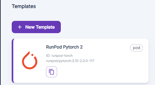
GPU Cloud and Serverless Templates are now on the Templates page, with a dropdown to toggle between the two categories. In addition, the Custom Templates language on the left has been changed to simply Templates.
Standardization of Action Buttons
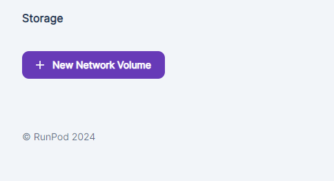
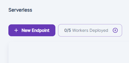
Previously, action buttons (such as "New Template") have not always been in a consistent area in the UI. Now, action buttons have been standardized to show on the top left section of the relevant page. They have also been standardized to have a consistent appearance.
Questions?
Feel free to contact us via email, Discord, or live support chat - we are here to help!
